What am I able to do in 7 days? Since I’ve been working in interdisciplinary teams for a long time, I got curious about my design skill boundaries. Setting myself a time goal of 1 week has been a refreshing deadline since I’m usually working on very long-term projects, which generally vary between 6 months and 4 years.
YES IT’S THE SCOOTER BRAND UNU!
Since I’m a happy unu owner and very excited about their upcoming products, I decided to design digital features of their much anticipated second unu generation.
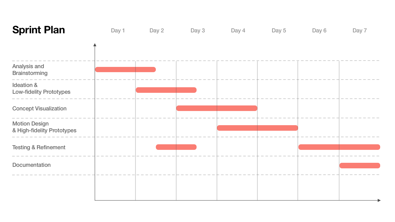
I made a high-level plan of how to tackle down the project where I balanced out my workload between UX and UI design. In my estimation, refining after testing the low- and high-fidelity prototype should be a great way to give the concept certain robustness. But you never really know, if the plan works out🤷
COLLECTING PROBLEMS AND INSIGHTS
By utilizing multiple research methods, I started to collect ideas through observation, shadowing, and interviewing. Due to the COVID-19 pandemic, I wasn’t able to use my conventional processes, which led me to the other attempt: Utilizing social media tools to ask people about different aspects of Scooter driving. Thanks to Instagram, I already got some powerful tools for polls! With interviews via video call, I continued to collect more insights and needs about people’s experience with an (electric) scooter.
Why do they drive one? Did they ever have touchpoints? What has been a hurdle?

‚I was joining a drive and loved the feeling of wind in my face. It’s great to get from A to B with steep hills in your way.‘
'I have no driving license, but if I ever get one, I’d definitely drive with a scooter instead of a car in town! But I’d need to practice a lot first.‘
‚ITS CRAZY WHEN YOU ACCELERATE THE FIRST TIME‘
After interviewing multiple people with some scooter experience, I realized that they usually learn driving the hard way. Either it’s their ambitious older sibling teaching, first sharing ride or even discovering it the hardcore way in South East Asia. I heard crazy, dangerous stories! 😨

Actually learning how to drive a scooter can be tough, especially if you feel insecure about what you’re able to do. At the same time the learning curve is pretty flat after that, especially if you drive one with automatic.
When I teach and watch friends learning, I tend to be concerned if it was the right thing to do… But they seem to have fun.
It’s noticeable that people tend to see a scooter as a lifestyle and fun way to get around town. Some are scared and would need to practice first before they are speeding around the crowded streets. Having the feeling of wind in your face while driving with your partner hugged to a remote picnic spot is very romantic, right? 💐
I WANT TO DESIGN THE ENTRY FOR ELECTRIC SCOOTER PLAYFUL AND EASY.
After collecting tons of insights, I started to use this knowledge to create the persona Sophie and a related User Journey about her moment when she receives her beloved scooter.
As I already interviewed different persons, I continued the collaboration process and invited my roommates (who are very new to UX) for a creative fresh up to think into a day of Sophie. 🎉
SOPHIE IS EXCITED BUT ALSO INSECURE AS SHE’S UNFAMILIAR WITH SCOOTERS AND CARS
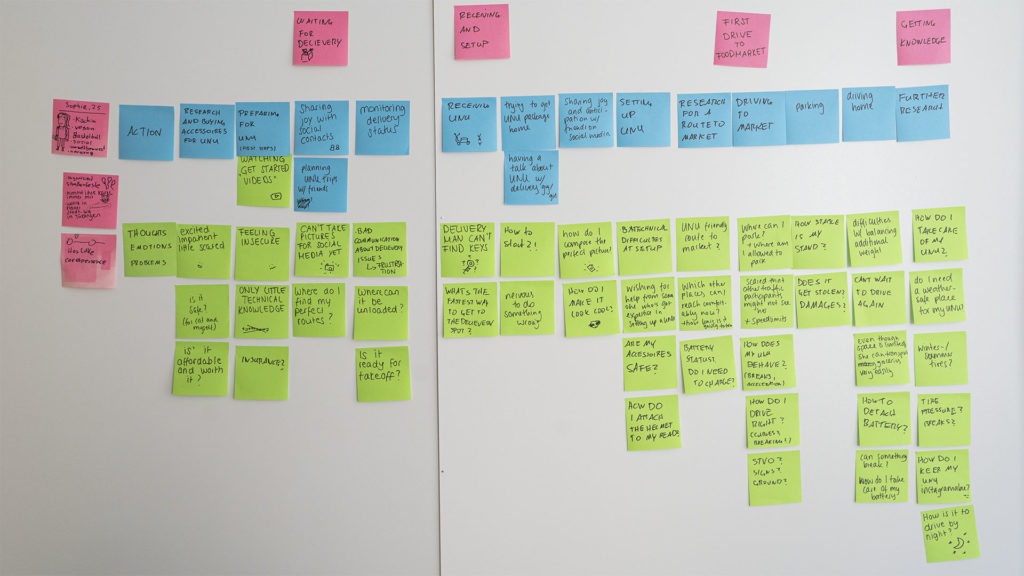
- Learning about the possibilities of Sophies unu should be intuitive and straightforward. As there might technical challenges coming, I want to help Sophie as much as possible. Like with a knowledge base where she could learn all essential things beforehand or after receiving.
- Sophie is quite excited about her scooter, and I want to make the introductory experience fun and playful to give a smile while waiting or the first time when she setups her unu.
- Sophie’s friends are also excited, as she tends to post some updated while waiting for the final day of arrival. Of course, they want to try to drive it or even borrow the unu for a day. 😉
FROM A USER JOURNEY TO A USER FLOW FOR DIFFERENT TASKS
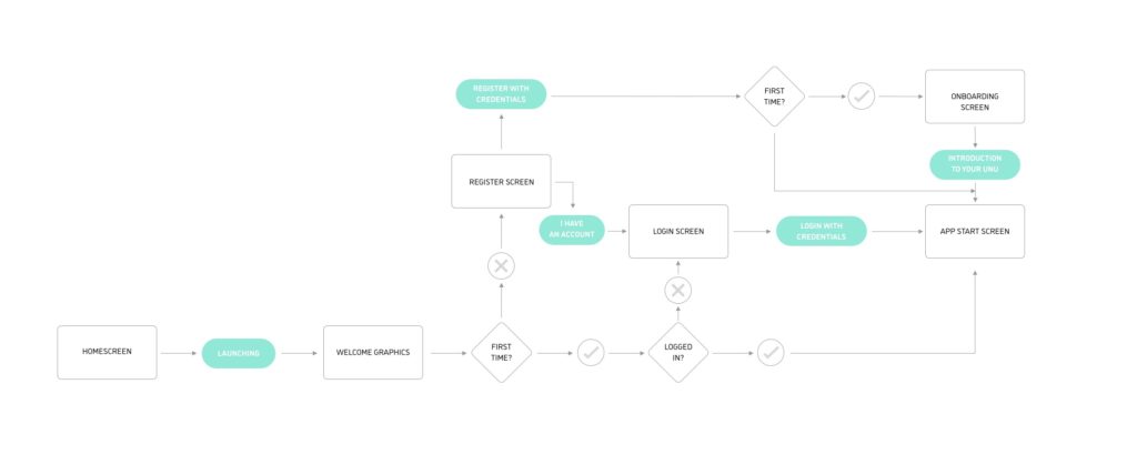
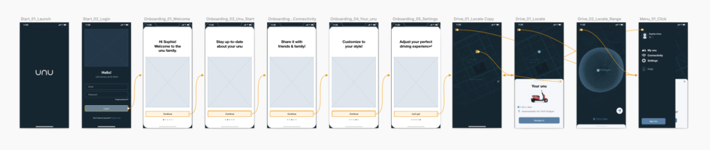
When Sophie bought her unu, she already created an account to log her in. At receiving her scooter, the unu app allows her to make essential adjustments at an onboarding screen like to give her unu a name and set a beginner mode to practice first.
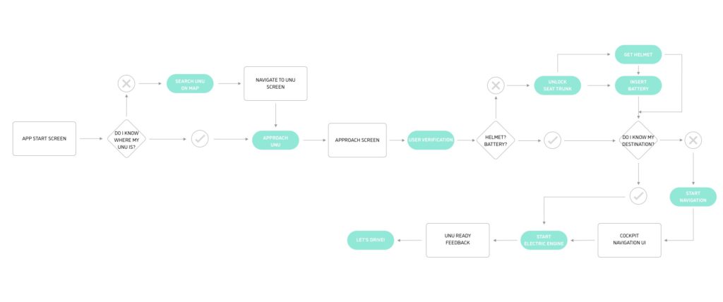
The unu app provides Sophie everything necessary to find her unu, especially when she borrowed it over a friend who left it in a crowded area. There’s an in-app map where Sophie can navigate quickly to her scooter and use the blinking lights feature to make her unu shortly visible.
Sorting information and structure it intuitively
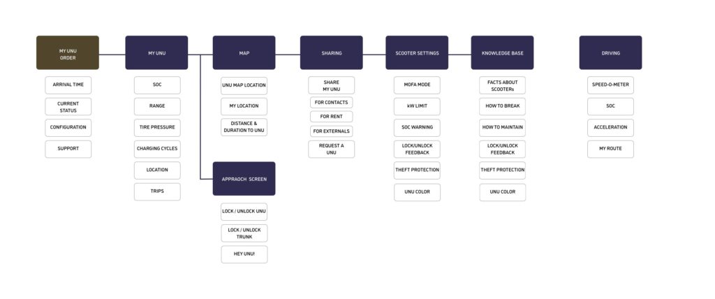
After analyzing the needs of Sophie and ideating solutions, I collected the most important information she needed in different situations, clustered them in applications, and defined multiple features to make her life more comfortable.
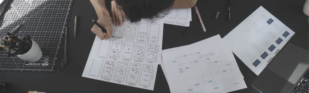
Paper wireframing & testing with POP
I often find myself to bring designs much faster on paper and iterative ideas more easily. Tools like POP are making explorations super simple and fun!
Low-fidelity user flow for the log-in process
The unu app provides Sophie everything necessary to find her unu, especially when she borrowed it over a friend who left it in a crowded area. There’s an in-app map where Sophie can navigate quickly to her scooter and use the blinking lights feature to make her unu shortly visible.
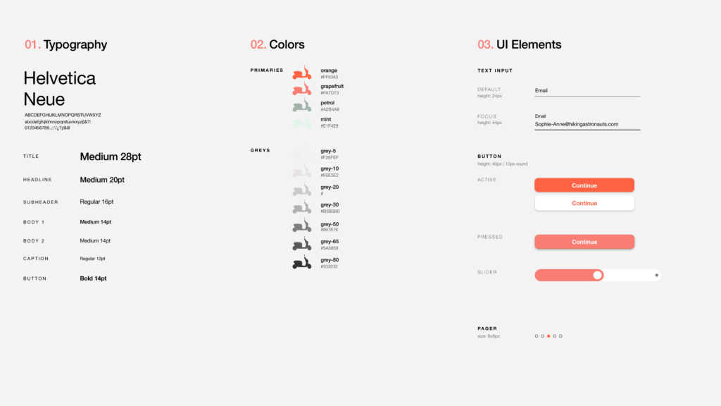
VISUAL GUIDELINES FOR THE APP
As in the case of visual aesthetics, I actively decided to go a more flat illustrative way. For me, it’s very streamlined to animate specific components and keep all the graphics in key. Typography wise I continued to use one-of-the-most-down-to-earth neutral fonts ‚Neue Helvetica‘ to give the app a modern look, and my design intentions a bit more space to bring in playful color and shapes.
ICONS AND ILLUSTRATION
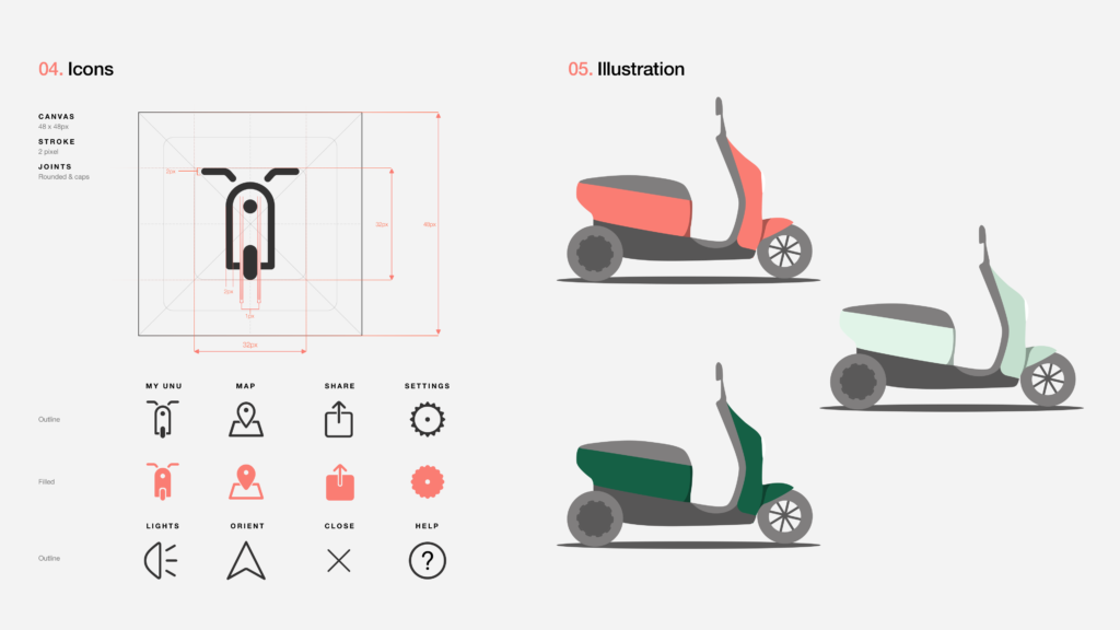
To design pixel-perfect icons, I created a 48 x 48-pixel canvas as a container and drew the vectors into a 32 x 32 pixel to have a balanced 2:3 icon ratio. Pixel multipliers by 8 pixels prevent artifacts or bleeding when displayed on targets.
2 pixel strokes continue to give the icons a modern which matches very well the chosen grotesque font. To keep the intention of the playfulness and I decided to make all joints rounded caps.
HIGH-FIDELITY PROTOTYPE
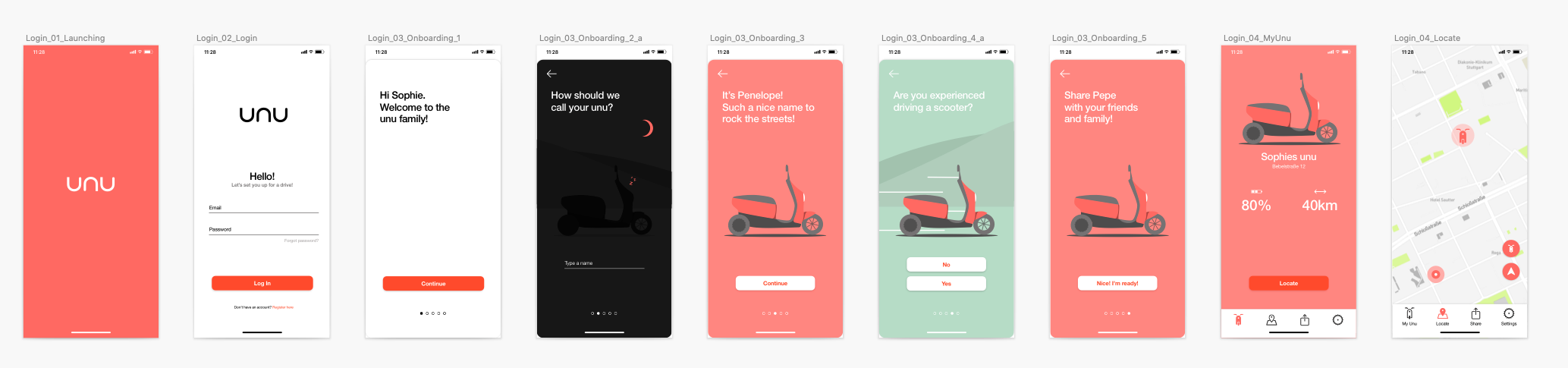
So Sophie just received her unu, and now it’s time to rock the streets! In this example, I visualized how a simple first-login process could be looking.
I used ProtoPie and Lottie animations to create a playful prototype and evaluate the look and feel. It’s very easy to use and I’m able to share for further testing.
WELL, IT’S A WRAP. BUT I’M NOT DONE YET!
The time frame was tight, and this was only my first shot at tackling down a UX/UI process! Now there’s further research, testing, and ideation necessary to give a small started project enough robustness. I’ll continue and try to utilize a Week 2 to add potential improvements to the digital product.